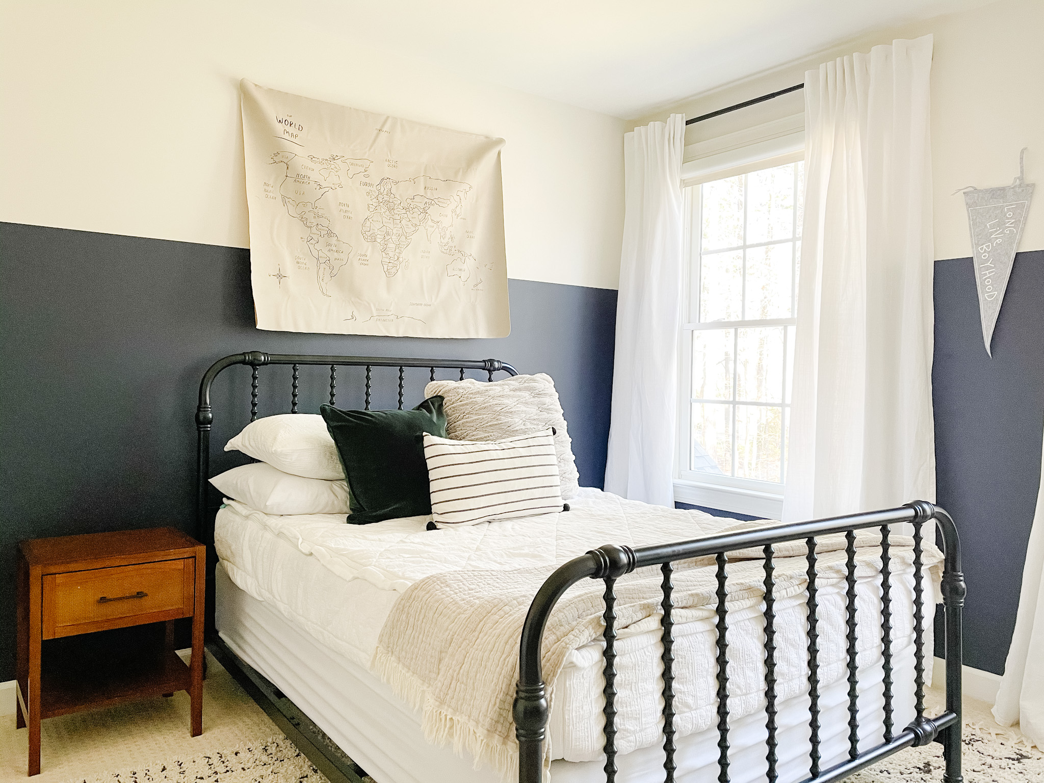
I’m back at attempting to blog! I’d really like to get more consistent with it so I can share multiple angles and all sources in one easy to access location. Hopefully I can provide you with some inspiration along the way! So, to start back up since we moved in November, I will be sharing Conrad’s room with you!
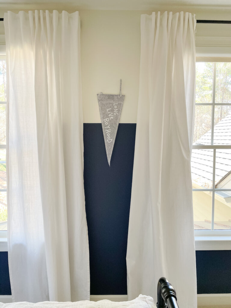
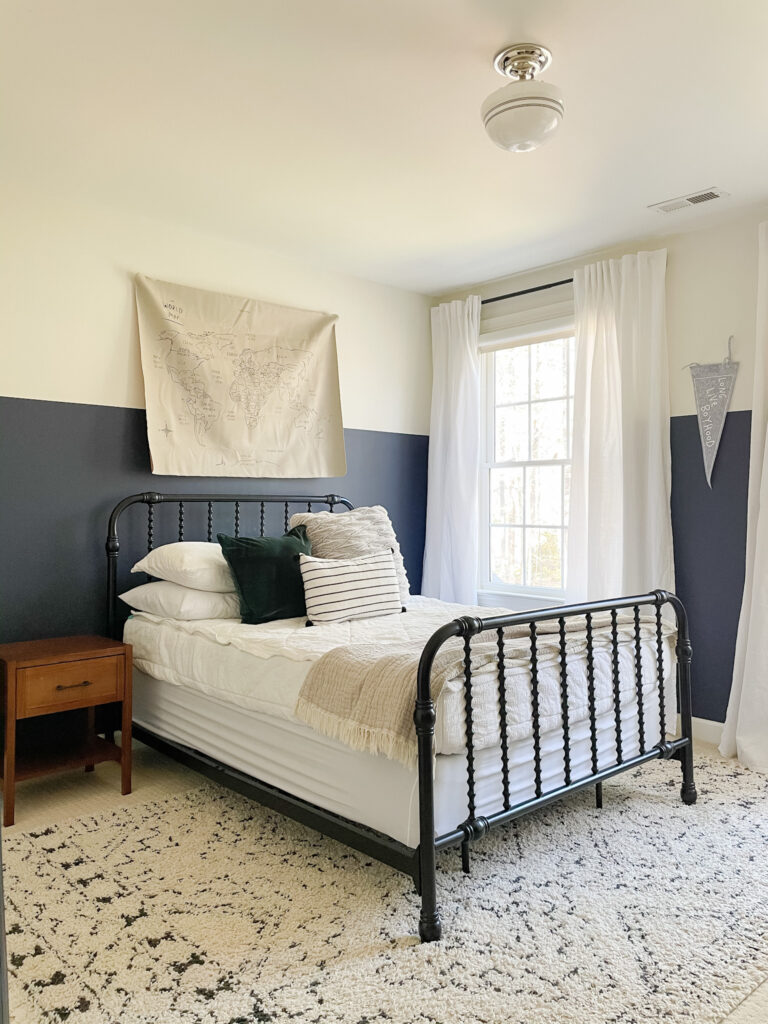
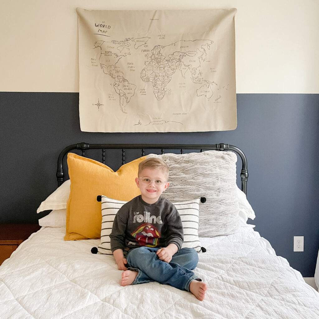
I had a couple of different thoughts for what to do with his room when I was planning the kid’s spaces in my head. I had thought about blue or green shiplap (still might happen) or the color-blocking in either blue or green. Obviously as you can see in the photos, I started with the blue color block. Shiplap was something I had never done (I did recently learn, so I’m thinking either keep the color block WITH the shiplap, or board and batten the bottom/blue portion), and I wanted something that would be relatively quick to accomplish. This project was pretty easy and I feel like it made a dramatic difference.
The blue paint on the bottom portion is Hale Navy by Benjamin Moore and the upper portion is White Dove by Benjamin Moore.
I used a lot of pieces in his room that I already had from our old house, like his bed, Beddy’s bedding, nightstand, rug and dresser. The IKEA curtains were also old, but I hadn’t used them in 5 years and glad I held onto them, because I think they make a great, but simple, addition to his room.
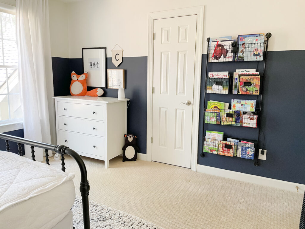
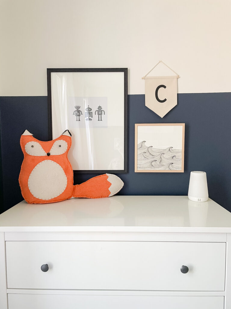
When it came to the details in Conrad’s room, I knew I didn’t want to do a specific theme. As most of you know, kid’s interests change frequently, so I didn’t want to be stuck in a year with something he wouldn’t like or wasn’t interested in. His room has sort of a coastal vibe with the blue and white, but it definitely doesn’t have a distinct theme. In the large black frame, I put a robot print (he currently loves robots) that I got off Etsy that can easily be changed with his interests. The waves print and frame is from Minted, so that is something that wouldn’t be as easy to change out, but it’s very simple and I don’t foresee him disliking the beach anytime soon. He frequently talks about the beach and I just loved the print, so I thought it was a fun addition. Because of the 2 frames, I wanted to add something with a different shape and a little texture, so I found the little ‘C’ banner on Etsy, too. I also added the “Long Live Boyhood” banner which I thought added additional texture and shape variety.
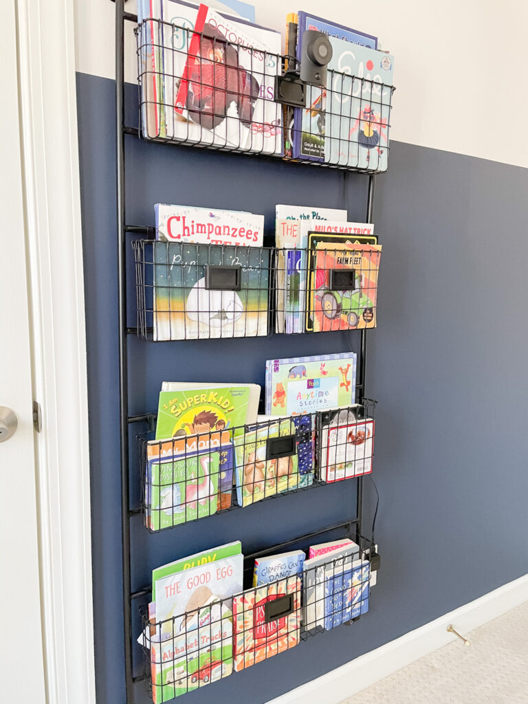
The wall rack was something I had seen from two other accounts and I thought it was such a unique way to organize books. I have really loved it so far, because while it can look a little messy at times, it’s still so much more organized than a bookshelf or cubbies. I also love that it doesn’t stick out too far from the wall and takes up minimal wall space compared to a bookshelf.
We have had Conrad’s IKEA dresser for about 3 years and it is still in great shape. It’s the perfect size for him and has a very simple look that should work well as his space and interests evolve.
The last two details in his room that I was probably the most excited about were the map for above his bed and his light fixture. I was gifted the map from Gathre and I think it’s a great alternative to traditional art. The mat is functional as a mat, too, but I was inspired by several people who I had seen use it as a tapestry on the wall.
For the light, I knew I wanted to do something that was simple, but still a little playful. I love this schoolhouse styled light and I think the added stripes are what make it fun; both appropriate for a little boy and as he grows.
I would still like to add a table lamp or a wall sconce to his nightstand, but I’m still trying to decide what route to take. Overall, I think it’s a great room for a little boy that will transition well as he gets older- though you all know I’ll want to switch things up eventually 😉

